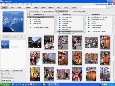
Dave, over at Picasa Musings does some mock photo's on what he thinks Picasa 3 should look like.
Explanation (via Dave): This mock-up is the LIBRARY with 'thumbs only' display preference. This would be the equivalent view to the current library, and picture area can be expanded by collapsing the browser and/or the left side panel at will.
Note: Corrected for grammar.
Dave's whole idea is to make Picasa simpler and easier to use, mainly by giving users more choices and moving some of the tool bars around. You can view more of his mock up's for Picasa 3 over on his web album.


![Darnell.Clayton[at]Gmail[dot]com](http://photos1.blogger.com/blogger/868/449/400/darnellgmail.jpg)


1 comment:
hey darnell, dave here, no worries. i don't check the site that often, but thanks for linking. hopefully with more discussion the developers might start programming some of this stuff :)
Post a Comment